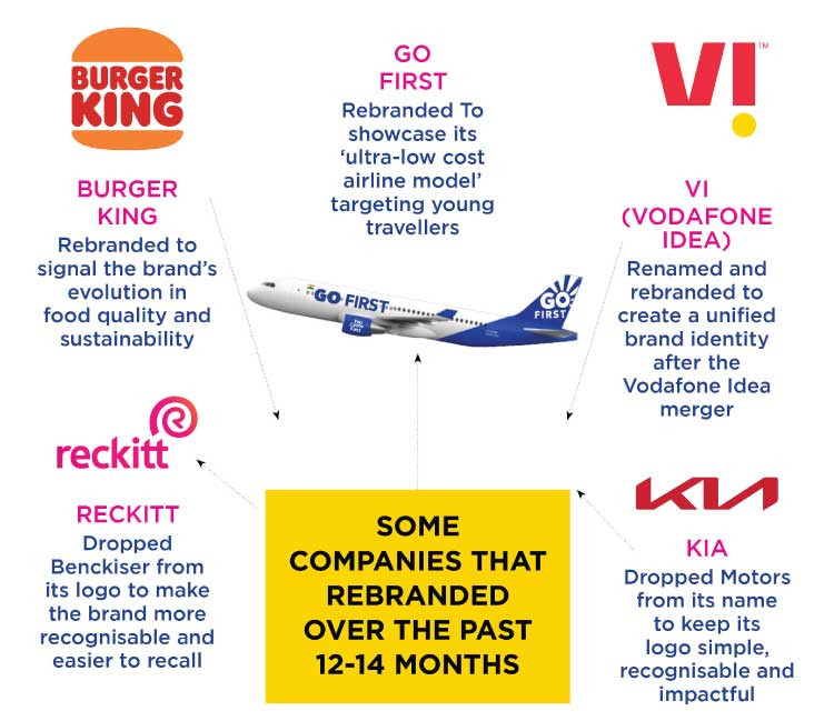
There is no doubt that the past year has presented a massive number of challenges for businesses across the board. With an unprecedented pandemic, lockdowns and dramatic changes in consumer behaviour, brands were left scrambling to make sense of the events that were unfolding in record time. What followed was a remarkable number of brands refreshing their identities since the latter half of 2020, changing their logos and brand positioning. We saw it first with Vodafone Idea that came to be known as Vi. Since then, over the months, we have seen GoAir rebrand itself to Go First after 15 years of flying and we’ve seen brands like Koo, Eureka Forbes, Burger King and cult.fit refresh their brand identities and positioning. Global consumer brand Reckitt too raised eyebrows with its move to remove Benckiser from its logo. These developments raise an important question – should brands let go of their older identities and transform themselves for a post pandemic era? Or is this the time that brands should remain steadfast to their existing identities, with which most consumers are already well acquainted.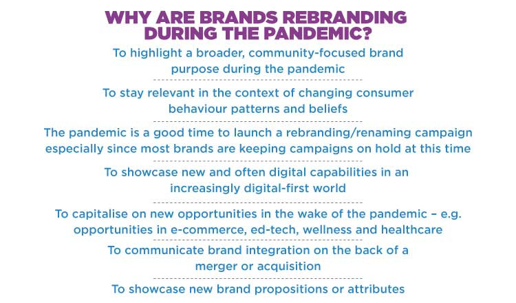
(*Source – brand and industry leaders)
WHY ARE COMPANIES REBRANDING THEMSELVES?
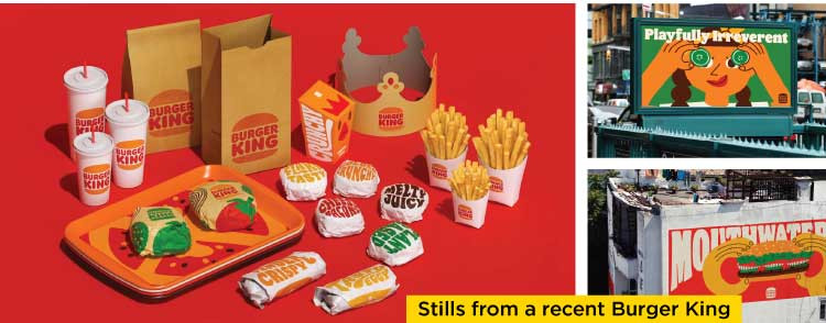
A rebranding typically is defined as a strategic move by any organisation, necessitated by the need to stay relevant in the context of a change in consumer attitudes, beliefs and preferences. It entails a detailed consumer understanding and environment analysis that leads up to the decision as well as the development process of the new identity. “Certain brand refreshes such as that of Burger King seem to be inspired not just by changes induced by the COVID environment, but fundamental driving forces of themes which began much before COVID such as natural, wellness, freshness and organic,” explains Ronita Mitra, Founder & Chief Strategy Officer, Brand Eagle Consulting, while adding that these trends might possibly only be accelerated by the changes induced by COVID, making this a relevant time to launch. Mitra refers to the QSR brand’s recent refresh of its visual identity – the first time it has done so in over 20 years to reinforce its evolution in food quality and sustainability.  Burger King of course is not alone in doing so. Indian microblogging network, Koo revamped its identity as it started to grow in prominence in recent times, especially with prominent government figures joining the platform. Elaborating on the objective behind the change in Koo’s visual identity, Mayank Bidawatka, Co-founder, Koo states, “We had made the old logo about 15 months ago while we were creating Koo. It was something we quickly made on our laptop in an hour. It wasn’t a very refined job. Since then, we have grown as a platform. We are now being used by millions of people and some of the most prominent faces in the country. We needed a new look that could do justice to our new reality. This identity change was important to reflect the new personality of the platform, whether or not it yields any direct benefits. Koo is here for the long run and it’s important to take these long term bets early on.”
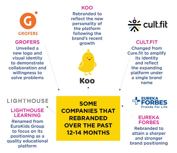
While some brands have chosen to rebrand themselves, others have chosen to create an all-new identity by changing their brand name altogether. Case in point – Cure.fit that recently re-christened itself Cult.fit and EuroKids that has renamed itself Lighthouse Learning. “We want to amplify our already popular identity and devote more  efforts to expanding the platform further under a single brand name,” explains Naresh Krishnaswamy, Growth and Marketing Head, cult.fit, adding that the brand’s endeavour is to reinforce itself as a fitness destination for consumers. “Over the past few years, cult.fit has become a well-known name in fitness and is recognised as a leader in this space. Under the cult banner, we have grown to offer a host of facilities such as group workouts, online fitness classes, gym and equipment-based workouts, swimming, and sports, amongst other things. We want cult.fit to become the one destination people think of when they have anything related to health and fitness on their minds. Our renaming effort is a step in this direction.”
In some cases, the renaming initiative is also meant to communicate a new company vision, like in the case of EuroKids Group that is now called Lighthouse Learning. “For two decades, Lighthouse Learning (erstwhile EuroKids) has been synonymous with pre-schools, one of the first organised pre-school networks in the country. But today, we are transcending into being a learning platform that goes above and beyond this category, age group, and to a certain extent, the physical boundaries of the centres. Our  pedagogy is powered by highly experienced educators and technology, driving 21st-century skill and higher engaging experiences,” explains Prajodh Rajan, Co-founder and Group CEO, Lighthouse Learning.
For companies that have been in existence for several years like Eureka Forbes, the rebranding was a necessity to bring its various brands together under a sharper, stronger brand positioning. The company now has two consumer-facing brands across categories of cleaning, air, health conditioners, security systems – Aquaguard and Forbes. Shashank Sinha, Chief Transformation Officer, Eureka Forbes explained the insights behind the company’s rebranding. “We  wanted to attain a sharper and stronger brand positioning and communication, so that we are able to fully address the needs of each of the target segments,” he pointed out in an interview to IMPACT last year at the time of rebranding.
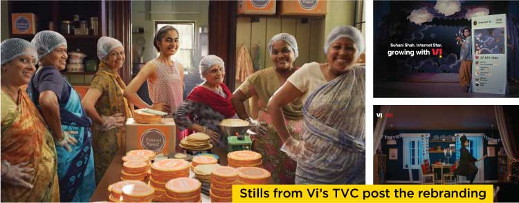
 In the case of the rebranding of Vodafone Idea to Vi, the objective was to signify the integration of two major brands, remarks Avneesh Khosla, CMO, Vi. “We launched Brand ‘Vi’ in September 2020 as a crucial milestone on completing the world’s largest telecom integration. In all aspects be it our network, people, processes or service and distribution, we had transitioned into a digital telco. Therefore, to bring a seamless and unified brand experience, we launched our new brand identity and made Vi a digital-first brand. This integration of two brands was a major step in our transformation journey and sets the path for the organisation’s future growth,” he states.
THE PANDEMIC CHALLENGE
From reinventing a brand to communicating its new vision and mission without confusing consumers, a rebranding exercise presents a lot of hurdles. Coupled with the pandemic challenge, this was not an easy task for many brands. As Lighthouse Learning’s Rajan points out, “We understand that a group rebranding initiative is a huge transition in a lifetime of any brand and it certainly was the same for us. But given the current situation in our country, in the midst of a pandemic, it doesn’t make it a viable proposition to go all out with our marketing initiatives at this time. Considering people’s sentiments, we have consciously decided to roll out all our campaigns and other initiatives at a slightly later stage when the situation is better and we are approaching some normalcy.”
“In the context of a brand change, it was a huge challenge,” remarks Khosla while highlighting the challenges that the brand faced during the Vodafone Idea rebranding. “But we still managed it quite successfully with all of us working from the safety of our homes and using digital means to communicate and ideate. In fact, the teams hadn’t met each other for a long time. For the necessary physical work, we ensured that the teams followed all the safety protocols,” he adds.
Rebranding, if not done on the back of a thorough market and consumer analysis could possibly end up diluting the brand’s image or leaving the consumer confused. Are brands seeing a situation where their new branding has created confusion? Cult.fit’s Krishnaswamy points out that the new brand name has in fact helped strengthen consumer connect. “So far, customers have welcomed this transition. They already have a strong connect with the name ‘cult.fit’ and we only expect this resonance to strengthen further.”
Rolling out high decibel campaigns and keeping messaging consistent also helps establish and cement the new identity. Like Vi did last year through its associations with high impact events like the IPL. “As per our internal research, the new brand has already surpassed the erstwhile brand on all consumer parameters and it continues to grow from strength to strength. In fact, our recent network campaign – India’s fastest 4G – has propelled the new brand to greater heights and won a lot of consumer love and appreciation,” remarks Khosla. “Our association with marquee properties such as IPL and engaging brand campaigns – in the 2020 edition which happened right after our brand launch, and the recent 2021 edition – have helped us create strong brand recall in a very short duration of time.”
THE QUESTION OF TIMING
While rebranding is not new to consumers or brands, the question that arises during a raging pandemic is whether this is the right time to do so? Could the move to rebrand or rename backfire, or would it resonate with consumers? “Pandemic time is a good time to re-stage brands. Advertising clutter is at its lowest ebb, and market eyeballs are focussed on whoever does launch,” asserts Harish Bijoor, Brand Consultant & Founder, Harish Bijoor Consults Inc. “It is extremely important to keep consumer sensitivities in mind when going ahead with launches. Just as long as the brand re-launches don’t take on a celebratory mindset, and respect the environment and sentiment around, things can’t go wrong. Things go wrong only when you swim against the tide of consumer sentiment,” Bijoor cautions.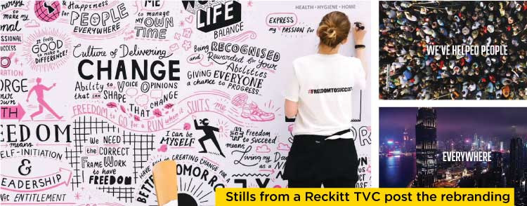

 Messaging that is tone deaf and not in sync with consumer sentiment and the environment will definitely backfire. The nature of change is important, observes Asparsh Sinha, Managing Partner, Open Strategy & Design. “Any change that makes a brand stronger always makes it more compelling. It has more to do with the nature of change than the timing of it. Brands have to naturally be mindful of the prevailing sentiment and concerns, and not put out things that are tone deaf,” says Sinha.
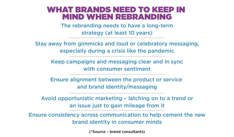
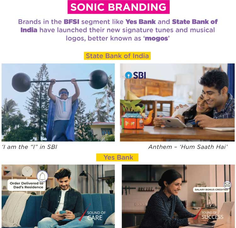
Ronita Mitra further adds that brands must take a long term view of things before taking forward a rebranding exercise. “The trap that brands should avoid is to undertake a brand refresh exercise as an opportunistic measure or a knee jerk reaction. Instead, be mindful that any new brand identity should be crafted keeping in mind a relevance longevity for the next decade at least, possibly longer,” Mitra suggests. Today it is not just visual identities that are being unveiled but also sonic ones! Banking brands like Yes Bank and State Bank of India have also recently created signature tunes and what is called a mogo (musical logo) to reaffirm their identities among consumers.
THE DESIGN PERSPECTIVE
Establishing the right logo, brand and product design is an essential aspect of both branding and rebranding. A logo not only develops a brand’s visual identity but also reflects its values and visions. The details of a logo communicate a brand’s strengths and attract the right consumers. Sharing her thoughts on the new Go First logo and its design, Ashwini Deshpande – Co-founder & Director, Elephant Design states, “Specifically about Go Air, there has been some thought behind what they were doing but from a designer’s perspective, when we go from a lower case to upper case, there is always an attempt to show more authority, more expertise and more age. Besides, I have a lot of issues with the word first in the airline world because it literally means the first class which comes with a whole lot of questions, beliefs, paraphernalia and services and so on. And when you hear from somebody who says we will call ourselves first but will be ultra-low cost, it just doesn’t align in my mind. In terms of colour, they have barely made any change. And the rays that they have added are very retro and are akin to the kind of graphic design we saw some 20-30 years ago. So we have to wait and see what the strategy is and how it unfolds. But as far as the logo design is concerned, I don’t think it is inspiring in terms of graphic design.” Global consumer goods company, Reckitt Benckiser, now known as Reckitt, was among the first few to rebrand itself during the pandemic. Mayuri Nikumbh, Head of Design, Conran Design Group helps analyse Reckitt’s all-new visual identity. “Most of the brand refreshes undertaken in recent times are an indication of present day, digital-first aesthetics – simpler forms, sans serif typefaces, flatter colours, straighter lines, soft gradients. While some are subtle changes that improve upon existing visual assets, some are radical changes, which indicate a bigger internal strategic shift,” she says. The Reckitt rebrand was in fact executed by Conran Design Group in the UK, she explains, adding that the design formed the perfect connection between intent and impact, making Reckitt’s strategy and ambition relevant and more visible to the world. “Most of these rebrands have given rise to more approachable and relatable versions as compared to their earlier conventional avatars. That’s definitely an indication of brands reaching out to have a warmer relationship with their consumers,” notes Nikumbh.
Open Strategy’s Sinha also echoes similar views on the recent Reckitt rebranding. “Of the lot, Reckitt rebranding is the most interesting one, as it is a shift in the body language of the brand. There is a clear move towards becoming younger and realising that today, one need not be serious to be trustworthy,” observes Sinha.
The current pandemic has underscored the need for companies to establish their identities and purposes like never before. Brands that keep in mind consumer sentiment and move towards values of solidarity and healing will have the edge in the current environment.


